We are designing a website for The Healthy Planet, a group of schools in Noida and Ghaziabad, Uttar Pradesh.
They are a remarkable school, in a world where education is being increasingly commercialised and regimentalised, Healthy Planet stands out.
They celebrate the individual in each child and guide their learning using proven pedagogical research methods and firmly believe in the power of play to build a love for learning.
So, now that the summer holidays are over, we are going back to school.
But no one’s complaining.
We’re playing around with shapes, colours, letters and learning a thing or two on the way.
Here are our wanderings about the planet:
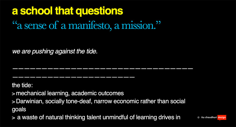
First off, we’re trying to give shape to the amorphous, cloud-like concept of the philosophy of education.
We’re trying to find the school’s voice. Who does it talk to? What is its take on the world? We’re giving Healthy Planet a manifesto, a sense of mission—to change education, by building a love for learning.
What are its poetics?
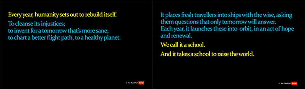
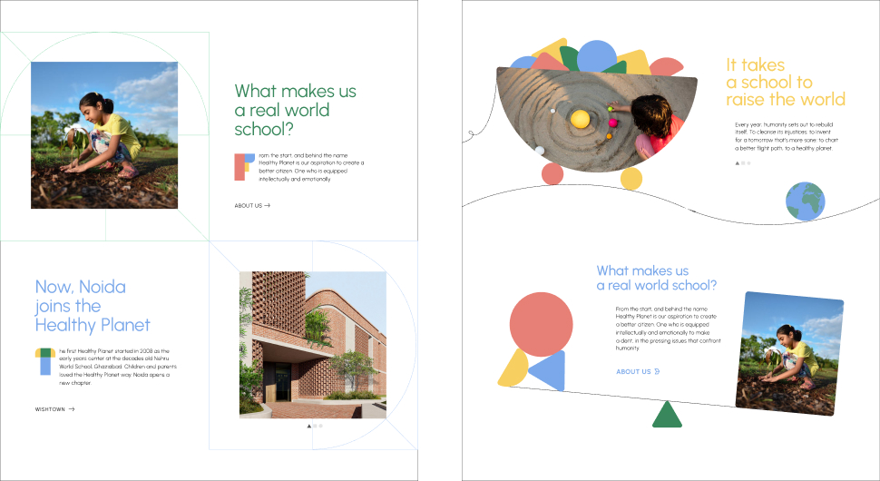
There’s an African proverb, ‘It takes a school to raise a child.’ The community plays an important role in the development of the child, a child doesn’t grow up in isolation.
Our views on education and schooling are encapsulated in a poem (poet: Itu Chaudhuri), ‘It takes a school to raise the world.’
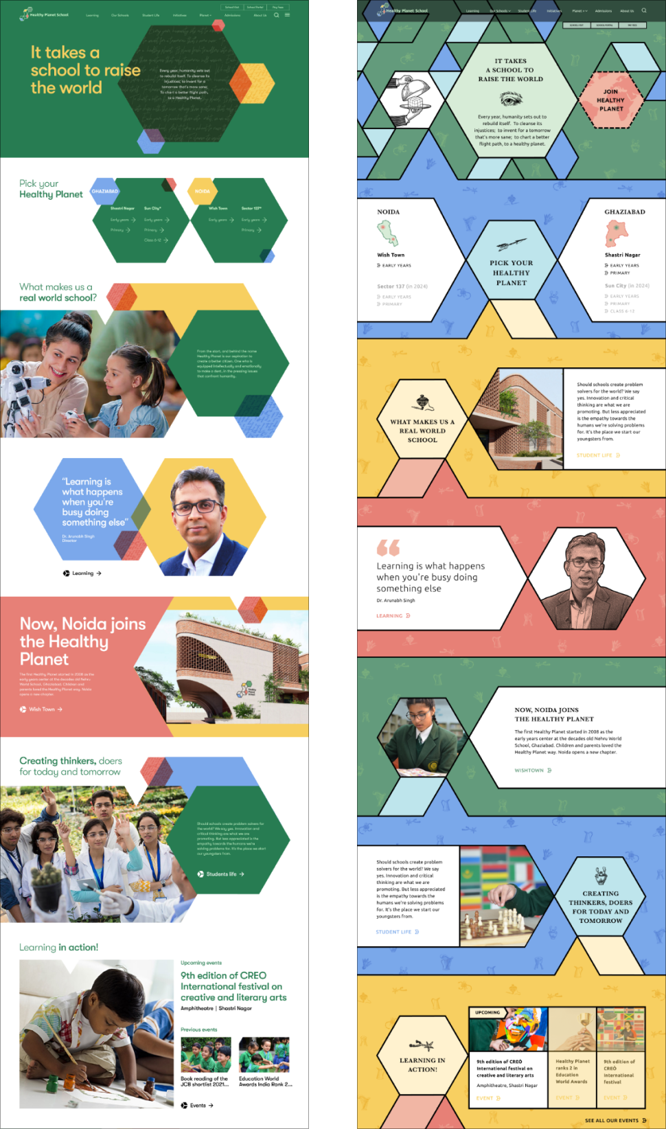
Moving on from the abstract to the literal
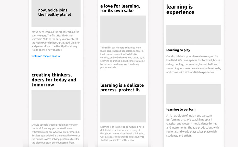
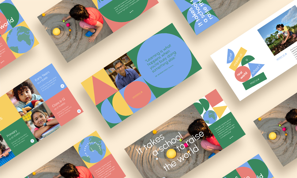
Wireframes and content generation progressed together—structured content design. Each page had its primary message and segues into sub-messages and connections with other sections
Images to drawings. Connectors to clay: many modes of play
We have a set of connectors (a toy with magnetic sticks and metal balls) at our play station and we often build weird, random stuff—shapes, structures and letters with it. So, we tried playing that into our design too.
Play dough inspired birds, stars, leaves, an apple, a ball, arrows—all hint at the elastic and mouldable child brain—full of wonder, curiosity and possibility.
Giving shape to meaning
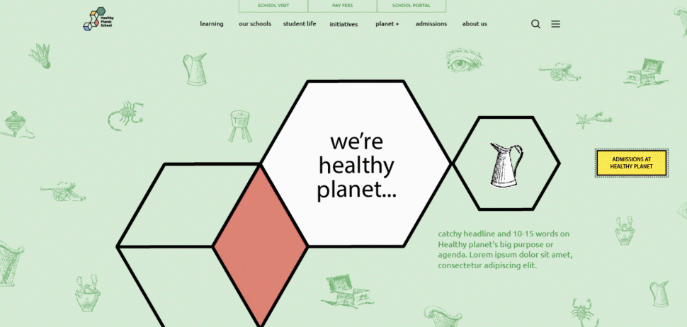
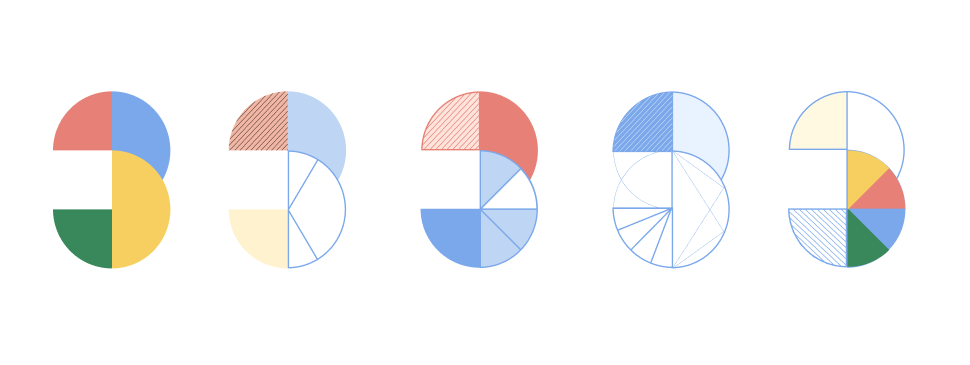
We inherited the Healthy Planet logo and the hexagon.
The hexagon is a unique shape, it’s found in nature— from honeycombs to snowflakes or as giant symbols on Saturn and Jupiter.
We humans have made great use of this shape too, in our telescopes and carbon nanotubes, it occupies the maximum perimeter in a given area.
A fitting symbol of the Healthy Planet philosophy—a perfect mix of nature and human ingenuity.
We isolated this shape, extending, scaling and overlaying it in different colours to explore a couple of initial routes.
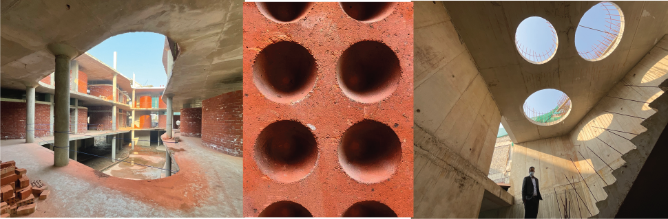
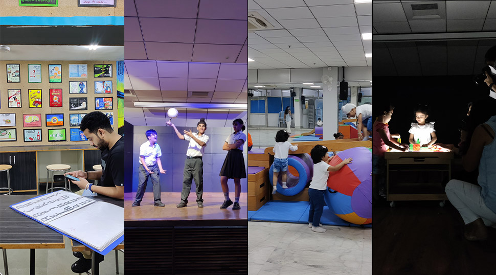
Site visit: understanding the Healthy Planet space
We visited the upcoming Healthy Planet campus to experience their built environment. We interacted and communed with space as an entity unto itself, from its grandest views to the fundamental building block—the humble brick.
We came back with a bagful of ideas and one red brick.
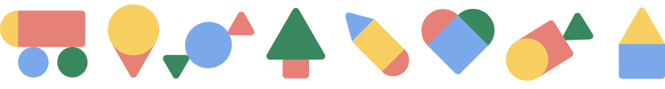
Objects of truth
Basic geometric shapes served as the building elements for a series of objects that we couldn’t stop dreaming about. Primal, playful, promising.
We’re also trying to use these primary shapes with lines and fills to form meaningful compositions.
We’re also stacking and making these shapes interact with each other—with interesting results. Building through play.
Inspired by the architecture of Healthy Planet, we’re composing ‘Jalis’ (latticed concrete screens, inspired by calligraphy, letterforms and geometry).
Basic shapes form the basics: letters and numbers
We’re using the same primary shapes to construct letters and numbers with interesting results.
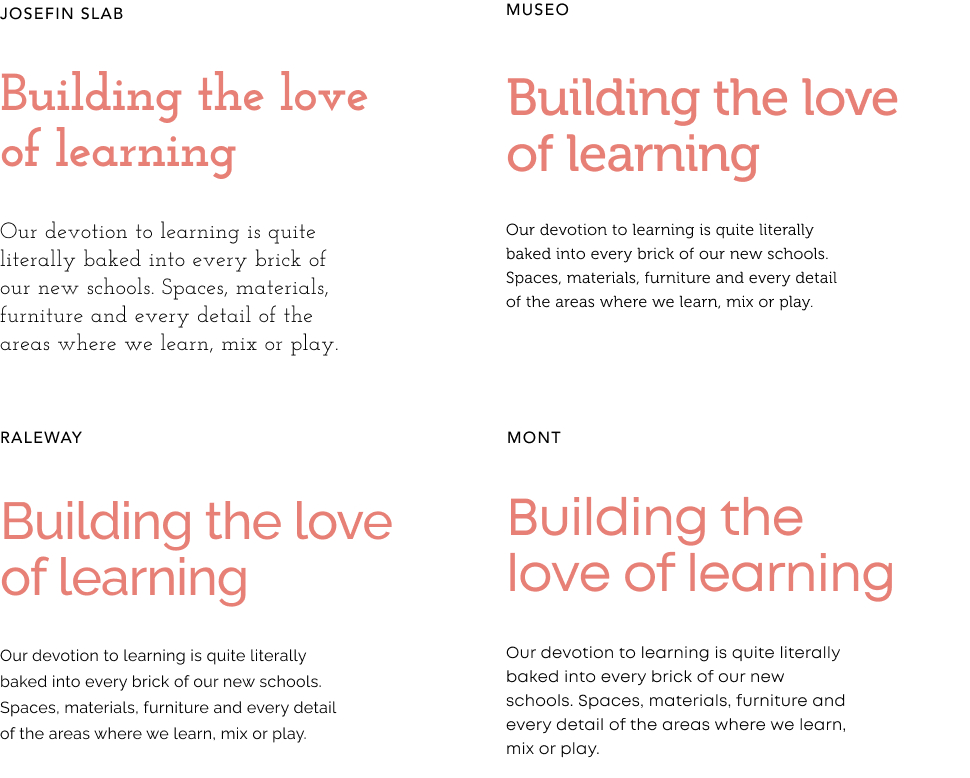 Typeface explorations
The right typeface transforms the experience for the user and lends a certain character to the message. There are quite a few of them in the running.
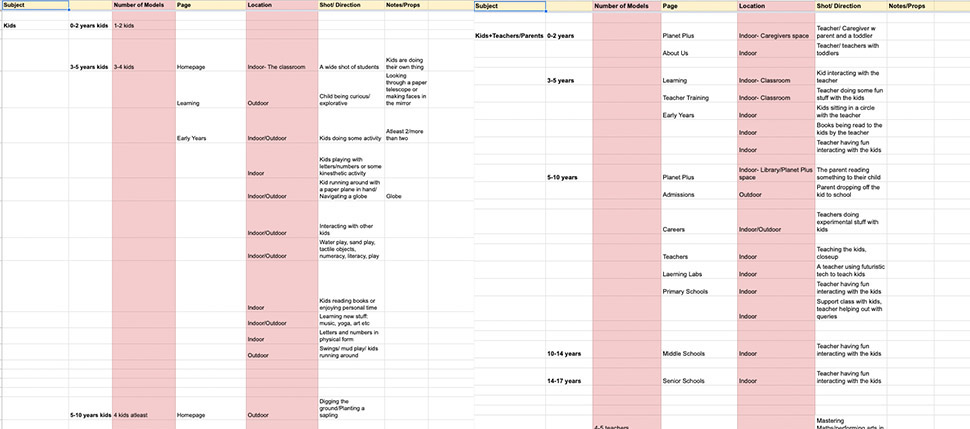
Photography: the seventh design element
We’re designing the website with an end image in mind, of children in their natural habitat; interacting with the space, the environment, the many situations and objects of learning.
Photography is how this will fully come to life. We’re art directing the photoshoots to ensure our vision is captured in the images.